Thursday, December 13, 2012
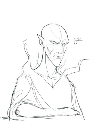
Nifelheimer
I worked a bit on this, there are some areas (cough cough the back) that i probably should have pushed further, but I feel it came out pretty awesomely.
Monday, November 12, 2012
Bodvild
Bodvild is the daughter of the evil King Nidud. After the entrapment of Weyland, Bodvild received the ring of his former beloved, Hervor. In some versions of the story, Bodvild falls in love with Weyland and bears his child, after she visits him to have her new ring re sized.
Saturday, November 10, 2012
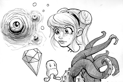
Nifelheim
This is an environment piece I started working on yesterday and today, I like how it is coming along so far. I hope you all dig!
Tuesday, October 23, 2012
Thursday, October 4, 2012
Tuesday, October 2, 2012
Monday, October 1, 2012
The Mummy
I just watched the 1932 Boris Karloff version of "The Mummy", so I drew this piece inspired from the film
Wednesday, September 19, 2012
Tuesday, September 18, 2012
Wednesday, July 18, 2012
Girly Sketch
 So I decided to "brush" up on my... brush pen skills drawin' some hot babes!
 cropped off the hand because I ended up cropping some of the image off that sucked, I will probably make some more expressive studies later.
Sketchbook_4
So I have been sketching a lot during work and class, some pictures come out decent, and others... well all that matters is that I am drawing right? I did these all with Faber Castel brush pens. I hope ya' dig!


Saturday, July 7, 2012
Late Post

It has been a while since I posted... mostly because I have vainly been waiting for my sketchbook to be returned, I have a lot of fun drawing in it I am wanting to scan in, just to show I haven't been goofing off, however, I still wait for it's return.
To help keep my blog flowing I will go ahead and post a Voldemort portrait image I have been toying around with.
The idea is as follows, what if the followers of Voldemort had a painting of him? The possibilities are endless... anyways I hope you guys enjoy it!
Tuesday, May 22, 2012
Friday, May 18, 2012
You're a Wizard Harry.
30 points from Gryffindor
Saturday, May 5, 2012
Thursday, May 3, 2012
Tuesday, April 24, 2012
Annabelle Gestures

Here are a few gesture drawings I did of my daughter while she played outside on the playground. I did these in graphite and also in felt tip pen.
Tuesday, April 17, 2012
Dorothy Redesigned
Saturday, April 7, 2012
Friday, April 6, 2012
Monday, April 2, 2012
Sunday, April 1, 2012
Monday, March 26, 2012
Monday, March 19, 2012
2429 A.D. The Sleeper
 I decided to do a Buck Rogers sketch. I am going to explore on the subject more, and probably find ways to push the overall design and shape of the character to make him more appealing. This study was done for the purpose of understanding his basic color, costume, and pose. Outside of those main elements the design is pretty straight forward and basic.
As far as explorations go, I will do a few different head designs, and play around with his overall silhouette, in order to come up with the most appealing design I would prefer to give him.
Thursday, March 15, 2012
Where no man has gone before

I have always enjoyed me a good ol' episode of Star Trek.
This was a fun sketch exercise focusing on the differences of facial structure. I stylized and exaggerated Spock more than I did with Kirk.
Tuesday, March 13, 2012
Trees of Oz

I was doing some tree sketches and some of them came out quite appealing, I like the Seussish (try saying that) look to them. These were done mostly for shape exploration purposes. I think Oz would have some interesting trees like this.
Monday, March 12, 2012
John Carter and sketches
Saturday, March 3, 2012
Ding Dong the witch is dead


(repetition allows each of these houses look as though they belong in the same town)
In these studies I explored the various shapes and diversity among the Munchkin homes in the Munchkin village. The color scheme follows that of the citizens and their shapes are based loosely off of farm equipment. If I were to take this further I would go in and detail the interior and exterior of each house.
It is also important to note that after I come up with one simple design through silhouette studies, I base a majority of the other designs close to the first one.
There's no place like Home

(silhouette studies are an important preliminary step)
Dorothy's house was pretty fun to do, I figured I would go for a very simple style for presentation that focuses more on shape design instead of detail. When designing and environment I feel it is important to work out the architecture and other structures first, then worry about where they are placed in the composition. Now that I have the basic idea of the house, I will base a three dimensional design off of the silhouette.
People of the Harvest

(variety in every one)
The Munchkins were a group of people that lived under the oppression of the Wicked Witch of the East. Above are some quick sketches of them.
When designing them I kept in mind that their life styles were not all that far from that of the Hobbits from Lord of the Rings. Seeing as they have more of a rural life style, I based their shapes off of squash like vegetables. The color scheme I used was a washed out blue. Blue was the color of the Munchkin kingdom, and I washed it out to show the drab life style they faced while under the oppression of the evil witch.
Friday, March 2, 2012
The Wonderful Wizard of Oz
I have been working on a few portfolio related pieces involving L. Frank Baum's The Wonderful Wizard of Oz.
Above I have two character lineups I have been working on, the top are my pencil rough's of the characters and below are the colors I plan on using with each character. I am certain a majority of people have seen the film based loosely on the book, The Wizard of Oz, so they will be familiar with most of the characters presented here, however, I am going to explain why I designed the characters the way I did.
The Scarecrow feels he will never be smart because he doesn't have brains, ironically he comes up with the most solutions in the group, my design for him gives him a carefree look and an over-sized head to show that he is less worried about the world around him, and more focused on what is going on inside his head, the inspiration for his look was Spike from Cowboy Bebop.
The Cowardly Lion was a real challenge to design. He has the largest mass and body of them all, however his posture shows a lack of confidence and shyness in his character. I originally went for sharper features, because Lions normally do, but to avoid having too confident looking of a character, I added more curves and circles to his overall form to help bring out his docile nature.
The Tin Man I gave Lumberjack proportions to his body, a larger chin, upper torso, and forearms is a common trend to those body types. I was certain to make his chest large because he had a large heart, or at least a strong conscience about all living things around him, truly one of the more emotional characters in the book. The red vest and beanie combo are tokens of his former life that he never let go of.
Dorothy went through many transformations. From young adult, to an adolescent child, I chose to go for very young age to help impress upon her innocence. I was certain not to go too far overboard with her design because I wanted to make her the most relate-able character. Even though she comes from a colorless world, I thought making her more vibrant than most of the characters would show how she brings color and harmony into the very colorful land of Oz.
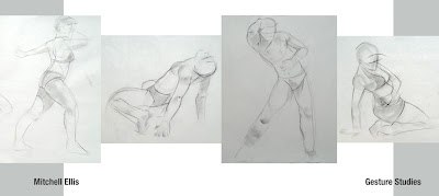
The Gesture

While these studies are far from perfect, I feel they demonstrate more of what I learn about myself the more I draw. Focusing more on the shapes and forms in a simple manner, allowed me to more effectively interpret the model when I worked on the more quick studies.
Wednesday, February 29, 2012
Bloggin' on up, up, and away
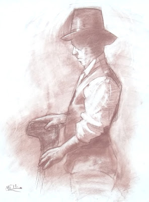
It is official now, my blog is up for the posting. I shall do my best committing myself to regularly updating this. But for now here are a few figure studies I have done a little while back.
When I did these I felt a good sense of accomplishment, and feel that my abilities were really starting to move forward. These pieces demonstrate my understanding of Form and Cast Shadows as well as some simple design principles.


 I will be retaking these photos in the near future so the quality of them won't be as poor.


 I will be retaking these photos in the near future so the quality of them won't be as poor.
Subscribe to:
Posts (Atom)


